
記住我
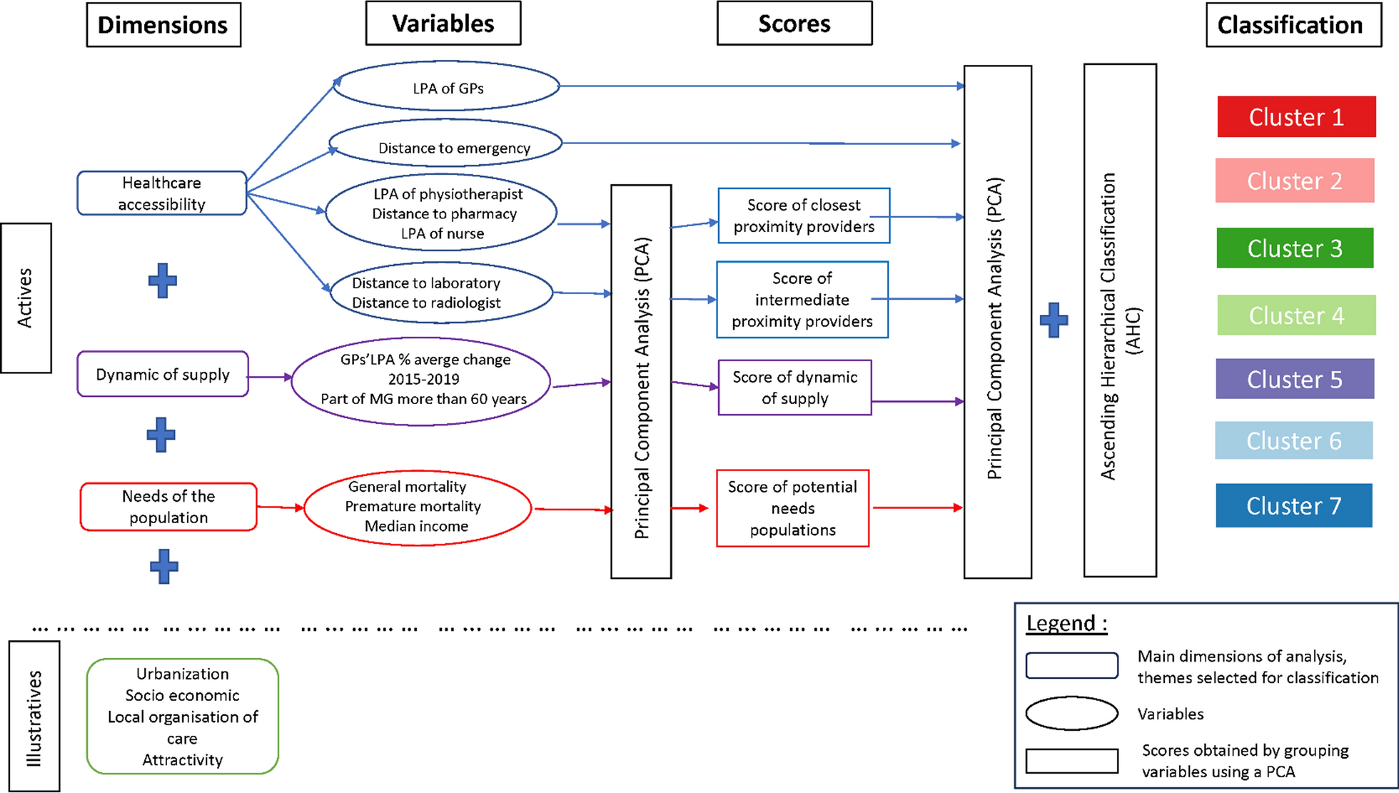


HRI due to PM2.5, NO2 and O3 was quantified using a top-down approach, introducing a combination of satellite remote sensing imagery, mobility patterns, dose–response functions, infiltration ratios and chemical transport modelling data. Diurnal air quality variability was obtained from hourly data of the multi-year reanalysis of the Copernicus Atmospheric Monitoring Service (CAMS) [27, 28]. The Fraction of Settled Area (FSA) was calculated from the World Settlement Footprint 2019 (WSF 2019) dataset [29] and used as a proxy for the probability of population’s presence. Indoor/outdoor concentration’s ratios (IOR) were taken from the literature [30, 31] and assigned to areas marked as “settled-building” in the WSF 2019. Relative Risk (RR) values from the WHO were utilized [32]. These data layers were combined to quantify the HRI of all-cause mortality, associated with the long-term exposure to air pollutants during the day and the night hours. The expression “all-cause mortality” refers to natural causes of death. Accidental or violent causes of deaths are therefore excluded. In the study, we compared the exposure of population to increasing HRI ranges in a static and in a dynamic population scenario.
The Health Burden (HB) aims at providing a measure of the potential impact of the exposure to air pollution on the economic and sanitary systems. This metric considers the number of people and their diurnal mobility patterns, obtained from publicly available mobility data for the Lombardy region, the “Matrice Origine/Destinazione 2014” (MO/D 2014). To build it, the novel WSF 2019 was employed [29, 33], which proportionally redistributes population figures available at the finest possible administrative level using local imperviousness and land-use information gathered from OpenStreetMap [34]. The data processing and methodology adopted in our study are outlined in Fig. 1. Information on all data layers and a detailed explanation of the HRI and HB metrics can be found later in this chapter.
Fig. 1
Conceptual representation of the data processing and derivation the Health Risk Increase and the Health Burden metrics
Study areaThe area of interest is Lombardy, in northern Italy, see Fig. 2. The location is particularly suitable for the intended study for a number of reasons. The region is one of the most densely populated areas in Europe: it hosts about one sixth of the total Italian population (around ten million people) and accounts for about one fifth of the share of the national gross domestic product [35]. The region is highly industrialized. The Po Valley is historically known to be susceptible from an air quality perspective. Due to its peculiar morphology, where the Alpine and Apennine mountain ranges limit the diffusion in the boundary layer [36, 37], high pollution levels are frequently reported. Despite the general emissions reduction following the strict lockdown measures implemented in Italy in 2020, mean yearly pollution concentration values, above the WHO air quality guidelines, have still been recorded for the area [4]. Furthermore, for the Lombardy region, datasets of population mobility are publicly available.
Fig. 2
Geographical location of the study area Lombardy, Italy
Air pollution dataCAMS is a service part of the Copernicus Program that provides hourly data on the regional atmospheric composition. The product consists of an ensemble of seven regional chemical transport models that have been increased to nine models after the upgrade performed in 2019 [28, 38]. Every day, analyses and forecasts data of the main pollutants are released with an hourly temporal resolution and a horizontal spatial resolution of 0.1 x 0.1 degrees.
The present study used CAMS reanalysis hourly data for the surface level of concentrations PM2.5, NO2 and O3 from 2014 to 2018. These where the most recent reanalyses data available at the time of the study. They are derived from near-real time datasets of previous years by means of the assimilation of and validation with in-situ observations from the European Environmental Agency.
Population density and mobility dataMobility data for the Lombardy region were obtained from the “Matrice Origine/Destinazione 2014”, a dataset developed within the regional mobility and transport program of Regione Lombardia. This is a matrix that presents the number of hourly displacements on a typical weekday within and between 1450 defined mobility zones in Lombardy. The matrix considers 8 modes of travel (e.g. car-driver, car-passenger, on foot, by bicycle, etc.) and 5 different motivations (e.g. study, work, occasional, etc.). The information is the result of the complex interaction between transport modelling, on-line questionnaires, face-to-face interviews carried out at railway and road borders, analysis of available surveys and of the existing demand detected [39]. It was built based on a transport model integrating the results of a survey held from February to May 2014 with data from the “2011 Census” of the Italian National Institute of Statistics (ISTAT) and with contributions from local authorities and stakeholders from the mobility sector. The number of permanent residents for each mobility zone is also available in the matrix and derived from the “2011 ISTAT Census”.
For this work, the data of the matrix were elaborated in order to obtain, for each hour of the day, the difference between the total number of displacements to/from each mobility zone, which represents the area-specific net number of commuters. The percentage in relation to the resident population was then obtained and the mean commuters’ oscillation across Lombardy and during the different times of the day was derived. The result is illustrated in Fig. 3.
Fig. 3
Ratio of net commuters and resident population averaged over Lombardy (Italy) for the different hours of the day. The dashed line represents the mean while the shaded area represents the standard deviation. Most of the displacement occurs between 6 and 9 a.m. and between 4 and 7 p.m
Most travel takes place between 6 and 9 a.m. and between 4 and 7 p.m. In these time ranges, the net commuters increase the residents of 2%. Between 9 a.m. and 4 p.m., the population of the areas is stable. Figure 4 shows a spatial visualization of the percentage of net daily commuters traveling to/from different mobility areas in relation to the resident population.
Fig. 4
Percentage of net daily commuters traveling to/in different mobility zones with respect to the area’s resident population in the Lombardy region (Italy). Orange to red colours represent an increased daily population with respect to the resident one while green to blue colours represent a decrease
Based on this observational data set, two scenarios were elaborated: a “DAY” scenario, where the population of the areas is given by the residents plus the net commuters, calculated considering the population at 3 p.m., before the start of the back-commuting and a “NIGHT” scenario, with residents only.
Population density and world settlement footprintIn order to assess the population exposure within the mobility zones, two data layers were derived. The first, the Fraction of Settled Area, was obtained from the World Settlement Footprint, a global settlement extent mask derived at 10 meters spatial resolution by jointly exploiting multitemporal satellite imagery from Sentinel-1 to Sentinel-2 [29]. The layer classifies each pixel as “non-settled”, “settled-building” or “settled-road”. The FSA was derived assigning a unitary value to settled pixels and zero to non-settled ones and performing an “average” resampling to 100 m spatial resolution. The FSA is used as a proxy for the probability of population presence.
The second layer is a population distribution layer for the “DAY” and “NIGHT” scenarios. For this purpose, the novel WSF 2019 population layer was employed, which estimates, for each 10 meters resolution pixel marked as settlement in the WSF 2019, the corresponding number of inhabitants. Specifically, this was obtained by proportionally redistributing the population figures derived from the MO/D 2014 by means of the local imperviousness, i.e. a reliable proxy for the built-up density [40], as well as land-use information gathered from OpenStreetMap. In the two scenarios, the total population was distributed to areas classified with specific land use labels. In the NIGHT scenario, from 8 p.m. to 6 a.m., the resident population only was distributed across areas labelled as “Residential”. During the DAY scenario, from 6 a.m. to 8 p.m., the population composed by residents plus/minus the commuters was distributed over areas classified as “Residential”, “Industrial” and “Commercial”.
Calculation of the health risk increaseThe hourly pollution data layers were oversampled in order to match a grid with resolution of 100 × 100 meters and interpolated using a bilinear method. Yearly aggregates of mean PM2.5, O3 and NO2 concentrations were calculated for the area of interest from the CAMS reanalysis data, separately for DAY and NIGHT hours. For PM2.5 and NO2 the yearly mean concentration was derived. For O3 a different metric was considered. Specifically, since O3 concentration presents relevant diurnal and seasonal fluctuations, the peak season aggregate was calculated for each year. This is obtained by performing the average of daily maximum in an 8-h rolling mean in the 6 consecutive months of the year, with the highest 6-month running-average O3 concentration [32, 41]. Finally, multiyear means between 2014 and 2018 were calculated.
Indoor/Outdoor Ratio coefficients, specific for each pollutant, obtained from the study of Monn et al. [30] and Cyrys et al. [31], were applied in correspondence to pixels classified as “settled-building” in the WSF 2019. A unitary coefficient was applied to pixels classified as “settled-street”. The IOR adopted for NO2, O3 and PM2.5 were, respectively: 0.8 (ref. [30]), 0.8 (ref. [30]) and 0.7 (ref. [31]). It is important to underline that these values do not consider indoor sources. The risk assessment therefore refers only to the contribution to health effects from outdoor sources. For each IOR coefficient, a range of values has been provided in literature. From these ranges, the highest value was considered in this study, in order to work according to a worst-case scenario.
The vulnerability to air pollutants on the increased all-cause mortality was determined using the dose–response functions provided by the WHO and expressed in terms of RRs. These are listed values derived by epidemiological studies, accompanied by their 95% Confidence Interval (CI). The WHO has recently released new RR values obtained through a meta-analysis conducted on the existing literature and published within the WHO air quality guidelines in 2021 [32]. They quantify the increase of the probability of a health outcome for a group exposed to an increased concentration of 10 µg/m3 of pollutants compared to the probability of a control group. The ratio of these two probabilities is the relative risk, see Eq. 1. If the RR is greater than one, the exposure to the factor considered is detrimental to the health. If the RR is smaller than one, it is beneficial. To be considered statistically significant, the CI should not range across positive and negative values [42]. For this study, RRs for all-cause mortality associated with the long-term exposure to PM2.5, NO2 and O3 were used. The considered values with their 95% confidence interval were 1.08 [1.06–1.09], 1.02 [1.01–1.04] and 1.01 [1.0–1.02], respectively. For PM2.5 and NO2 these values refer to the yearly mean concentration while, for O3, to the yearly seasonal peak metric, as described by the WHO [32]. In accordance with the approach adopted by the WHO, a linear dose–response relationship was assumed. However, as reported in the WHO Air Quality Guideline 2021 [32], a supralinear behavior can be expected at low concentrations, suggesting a steeper risk increase at lower exposure levels. Population exposure was quantified indirectly, using the Fraction Settled Area as a proxy variable and obtained from the WSF 2019. This was used as a measure the probability of human presence. Finally, the Health Risk Increase was calculated by multiplying the three components for each grid-cell in the domain, as shown in Eq. 2. The HRI was thus obtained for both the DAY and NIGHT scenarios. Geographical aggregates of the HRI were derived for the commuting areas.
$$RR\text \, \frac \, } \, \text \, \text \, } \, } \, \text \, \text \, \text \, }}$$
(1)
where: RR: Relative risk of mortality referred to a concentration of 10 µg/m3
The Probability of the disease with and without the exposure to the target factor is provided as relative frequency of the health outcome in the exposed group and in the control group.
Relative risks do not deliver information on the absolute risk of a certain health outcome but provide information on the increased or decreased likelihood of a certain health event, given an exposure to an external factor. This increased/decreased likelihood is expressed by the distance of the resulting relative risk from the unit value, corresponding to RR-1.
$$HRI=C*\frac *FSA*IOR$$
(2)
where: RR: Relative risk of mortality referred to a concentration of 10 µg/m3. C: Pollutant concentration in µg/m3. FSA: Fraction settled areas from WSF. IOR: Indoor/outdoor ratio (this is posed equal to 1 for pixels labelled “street”)
In line with the WHO assumption of a linear dose–response relationship, the risk increase is obtained by multiplying the pollutant concentration by the slope coefficient (RR -1)/10. The normalization by 10 is adopted because RR values by WHO are given for an incremental pollutant concentration of 10 µg/m3. The pollutant concentration is corrected by the IOR factor for pixels labelled as “building”. Finally, the value is weighted by the FSA, a number between 0 and 1, which is used as a proxy for the probability of human presence.
Calculation of the Health BurdenThe HB metric has been formulated in order to provide a measure of the potential economic and public health impact. This metric considers the number of people and their mobility patterns. As illustrated in Fig. 1, it was derived by multiplying pixelwise the HRI by the total number of inhabitants (P), obtained from the WSF 2019 population layer for the day and night scenarios, as illustrated in Eq. 3. The population group considered for the calculations included, in the DAY scenario, the residents plus/minus the commuters and, in the NIGHT scenario, the residents only. Geographical aggregates of the HB were derived for the commuting areas.
留言 (0)